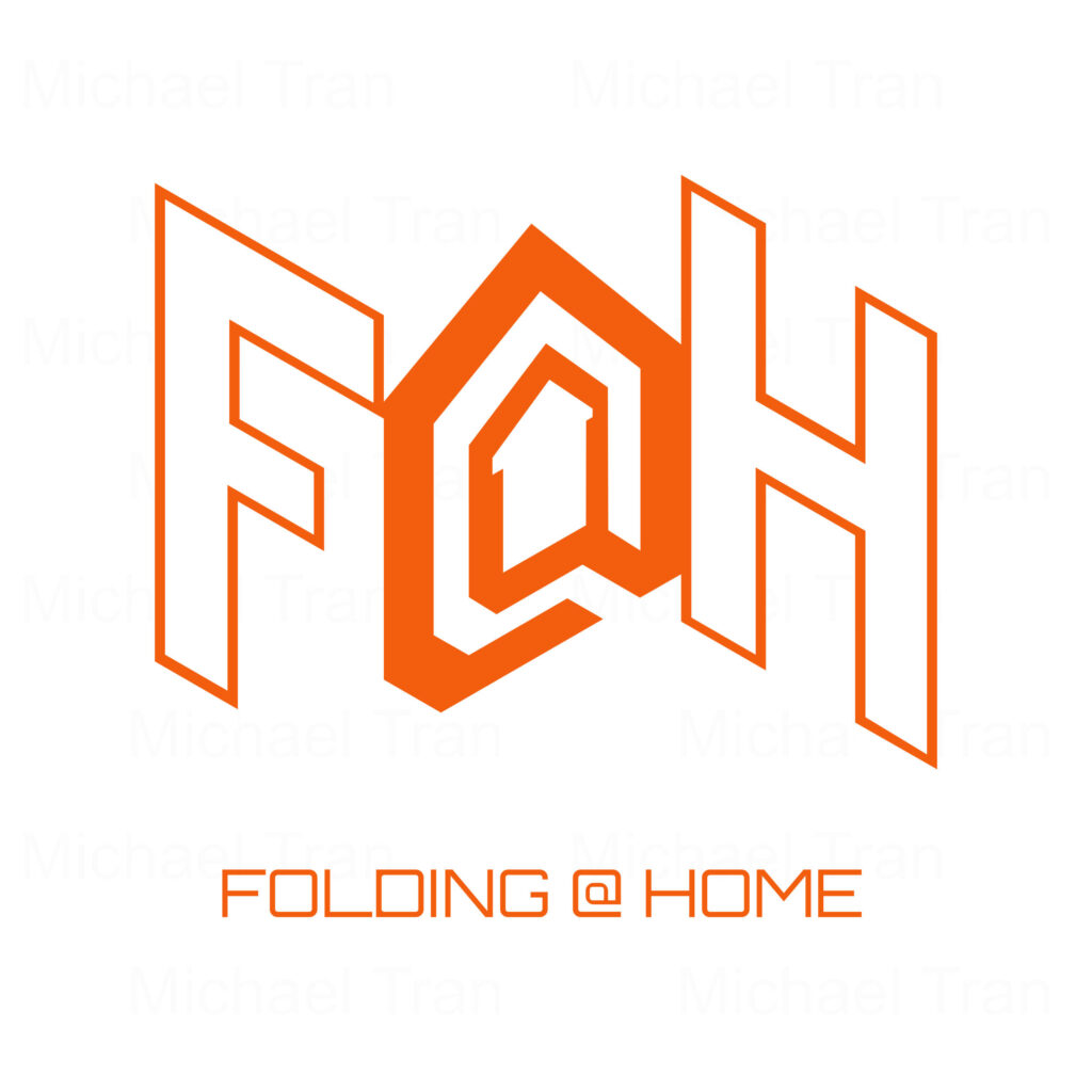
I created this logo design submission for the Folding @ Home research team. They are a group of scientists/researchers aimed to help develop new remedies to a variety of diseases by splitting up complex protein computer modelling into smaller tasks that can then be distributed to thousands of computers all over the world. For more information about folding@home, check out their website at https://foldingathome.org/
Although my design did not move forward, I wanted to point out my thought process behind this design. It was designed with the help of an isometric grid to convey the accordion-like design. The design was mostly inspired by the words “folding” and “home”. When I think of folding, the first thing that came to mind was folding paper. How folding @ home works is that it needs to be connected to a computer with at least a decent graphic cards to calculate and model tasks faster, and the internet. With that being said, I wanted to original ‘@’ symbol to look like an ethernet port, but then, I decided to use that negative space inside of it to create a silhouette of a home icon. This would reinforce the word “home.” Lastly, I decided to go with a sans serif font because it would give the logo a feeling of modern day technology assisting scientific research.
Overall, I enjoyed working on this project and learn a lot more on using Affinity Designer.

