Role: UX/UI Designer, UX Researcher
Tasks:
- Develop concepts
- Conduct surveys and interviews
- Create low and high fidelity wireframes
- Design a working prototype
- Conduct usability testing
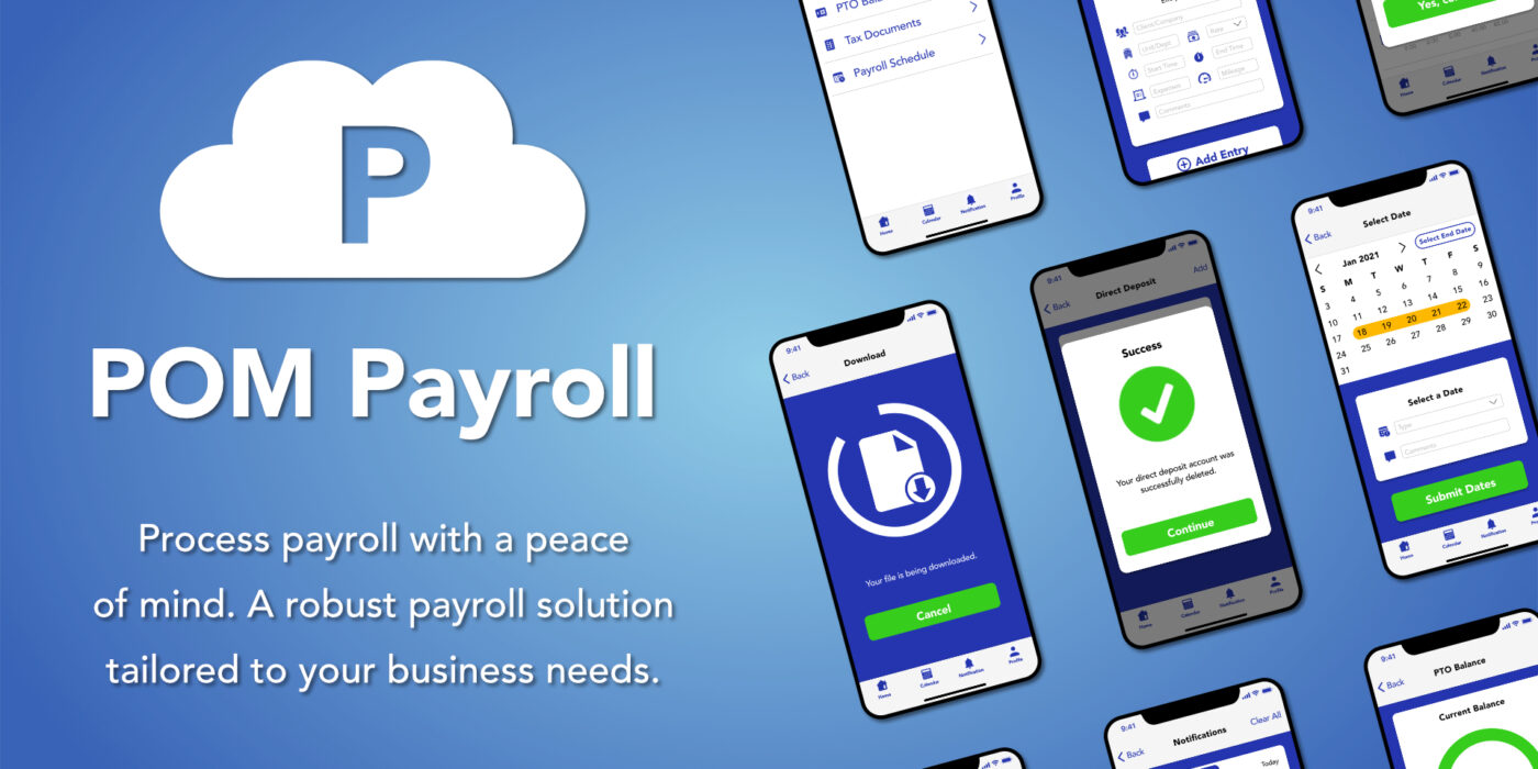
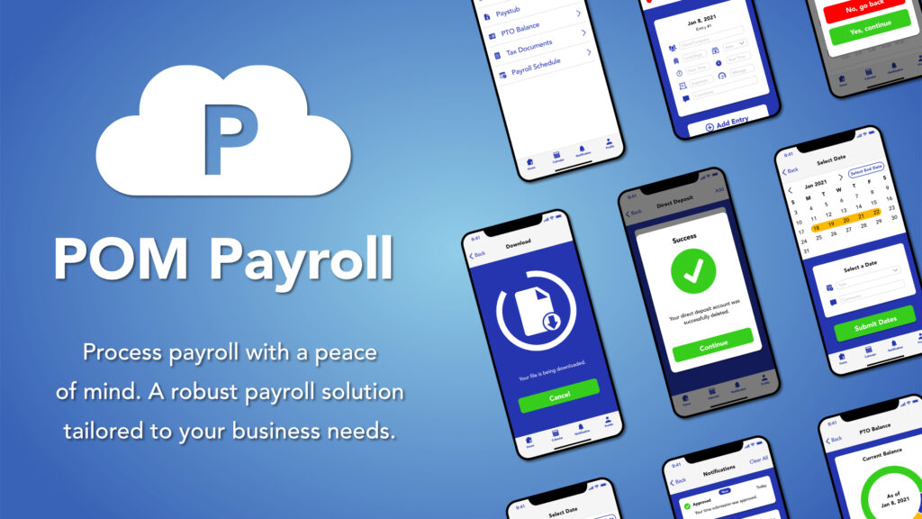
Introduction: POM (Peace of Mind) Payroll is a concept mobile solution for timesheet submission and approval management. Let’s take a look at how POM Payroll is tailored to meet the needs of one of their clients, a non-profit social service organization with approximately 2,000 active employees across 12 states and over 80 programs providing services for mentally and physically disabled clients. This client is looking to shift from a manual to a digital payroll process in order to stay current with the latest technologies. To protect the non-profit organization’s identity, I will refer to them as the ABC Company.
Without further ado, I will take you on a step-by-step journey on creating the POM Payroll mobile app.
Problem: When the ABC Company’s employees fill out their paper timesheets, they were prone to making mistakes such as documenting overlapping time, using insufficient PTO hours, and timesheets were sometimes difficult to process because their handwriting was illegible. This led to inaccurate payroll processing, delays, and increased dissatisfaction among the employees, managers, and payroll administrators. The ABC company is looking for a way to improve its timesheet submission and approval management process to reduce timesheet errors, minimize overtime work for employees, and process payroll in a timely manner.
Challenge: How can I make a mobile app that would make it easier for users to submit their time, minimize overtime hours, and process payroll on schedule?
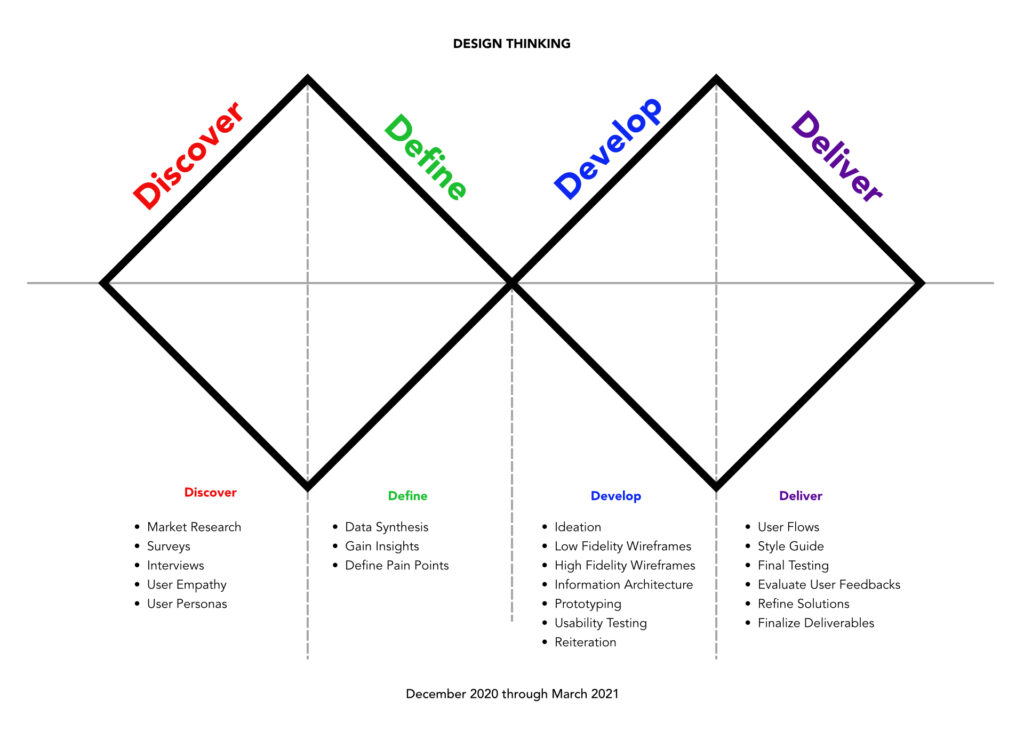
Design Process: I approached this project using the Double Diamond methodology: Discover, Define, Develop, and Deliver. It is a design model designers used to solve problems throughout their creative process.
Market Research: By conducting an analysis of POM Payroll’s competitors’ products, I was able to identify what advantages, disadvantages, missed opportunities, and what leverage their rivals have in the payroll market. Therefore, I have created a SWOT profile of POM Payroll’s competitors.
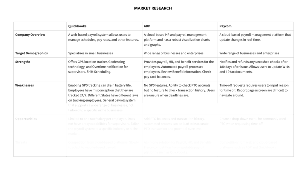
Based on the ABC Company’s needs and POM Payroll’s competitors’ analysis, I have decided to implement the following features for the app:
- Real-time push notifications to remind employees to submit their time
- Ability to check PTO balances and transaction history
- Efficient design that enables users to input less data; enter once, saved forever (except if the user clears the cache)
- Designate multiple rates for employees that provide different services or work at a different unit
Surveys and Interviews: In order to create an effective user experience, I have gathered some data and insights from the ABC Company by conducting surveys and interviews with their current employees and staff members. With a sample size of 76 survey participants along with 3 interviews, I was able to discover and identify some insights on the employees’ backgrounds and what their pain points were when submitting, approving, or processing timesheets.
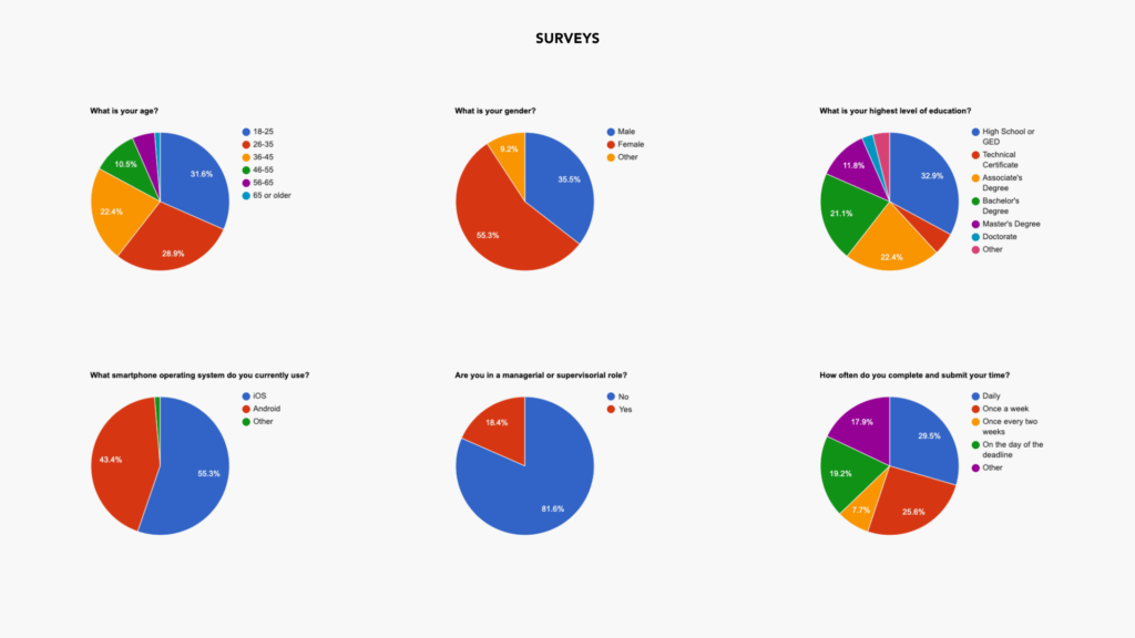
Based on the survey results, 19.2% of participants submit their timesheets on the day of the deadline. This makes it difficult for them to recall the exact times and which day the employees clocked in and out. This can lead to incorrect timesheets and delays in the payroll process. The ideal time for an employee to submit their time is right after their shift has ended. This is easier for the employee to recall the time they have started working. However, after a full day of work, an employee may be completely exhausted and this would have an adverse effect on processing statistical data which would cause them to put off submitting their time.
According to the surveys, there is a wide range of demographics from gender, age, and educational backgrounds. To ensure that the app is optimized for a wide range of users, the goal is to create user-friendly designs that are intuitive and require minimal effort to use. In addition, the design must also be accessible because the ABC Company may have employees with cognitive deficiencies such as color blindness.
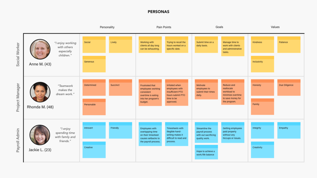
To gain a deeper understanding of the employees at ABC Company, I needed to interview 3 types of employees: Non-managerial employees, managers, and payroll administrators. That way I would be able to uncover what their pain points were from their perspectives. I interviewed a social worker that works out in the field, a project manager who would be approving employees’ time submissions, and a payroll administrator who would be processing the submitted and approved timesheets.
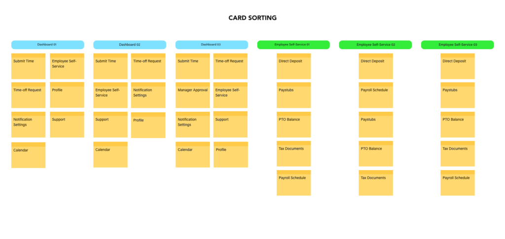
Information Architecture: To develop the structure of the POM Payroll dashboard and employee self-service screens, I have also conducted a card sorting exercise with 3 participants. In a card sorting exercise, the participants are given topics to organize them in a way that make sense to them. After organizing the topics, I was able to identify and define the common content hierarchical patterns and establish an optimal structure for the information architecture of the app.
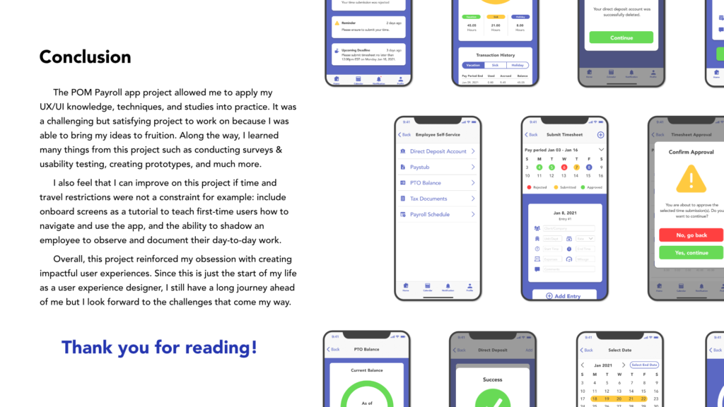
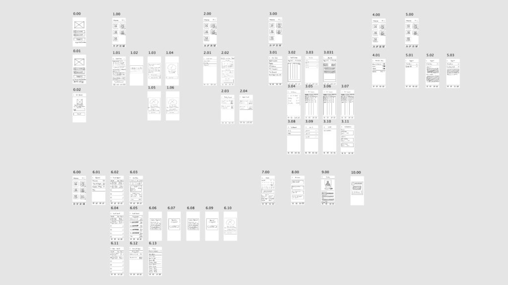
Ideate: After identifying what the needs and pain points of the users were, I would create low and high-fidelity wireframes to layout out the content structure. In addition, I must consider the different user types such as non-managerial employees and managers. Therefore, it would require a different dashboard screen for accessing specific functions or features.
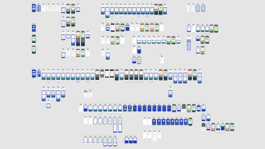
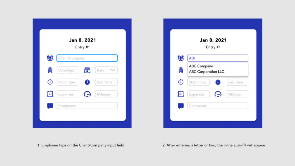
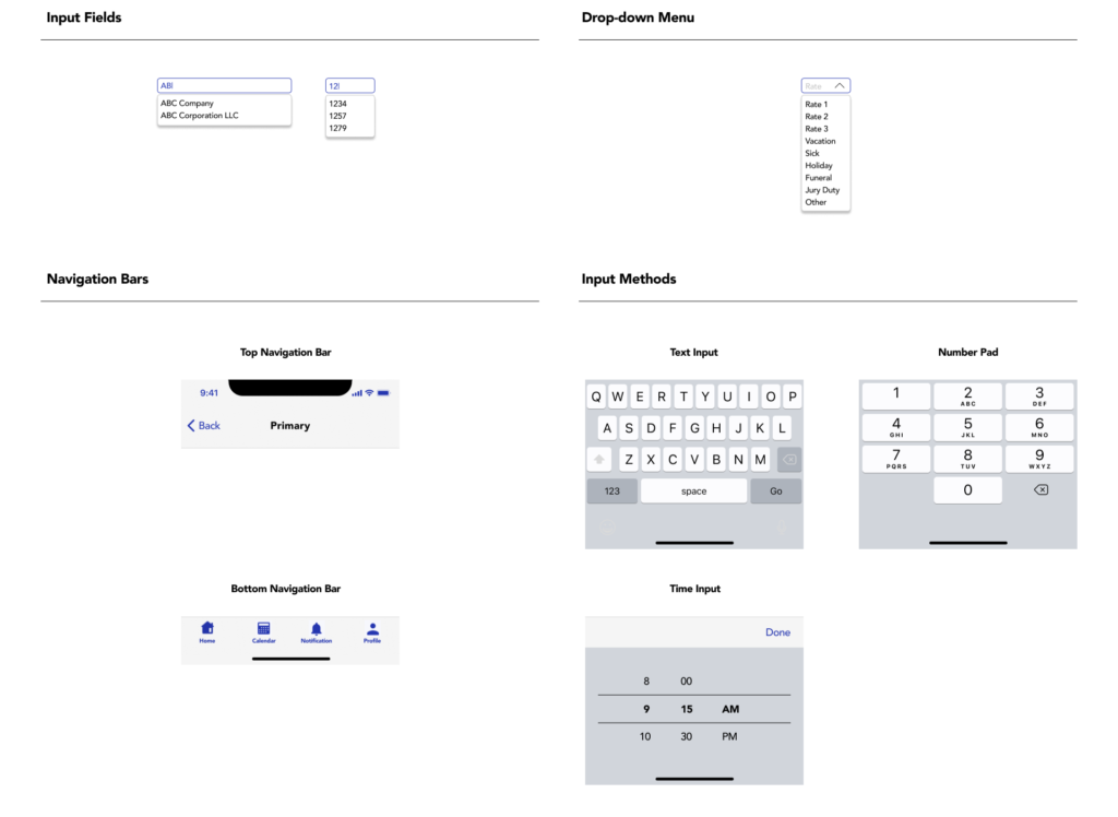
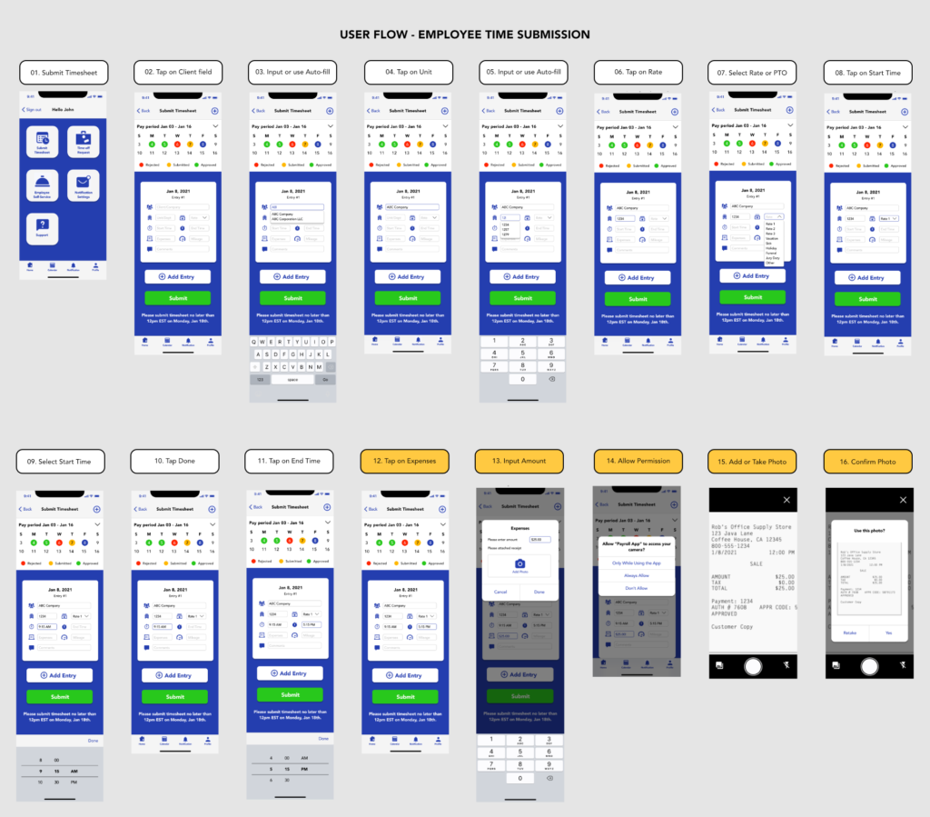
According to the Nielsen Norman Group heuristics, filling out forms should be made easy and requires minimal effort from the users. With this in mind, I have implemented an inline auto-fill feature during the high-fidelity development phase. Essentially, when an employee inputs a letter or number into the Client or Unit input fields, the inline auto-fill will populate because that would minimize the effort for them having to input the rest of the letters or numbers in and allow them to select the desired option.
Usability Testing: Next, I would conduct usability testing on an employee attempting to submit their time using a prototype that I have made. With minimal supervision, I observed, listened to, and documented what the user is saying, feeling, and thinking while attempting to submit their time. I was able to illustrate their journey and discover any opportunities to improve on.
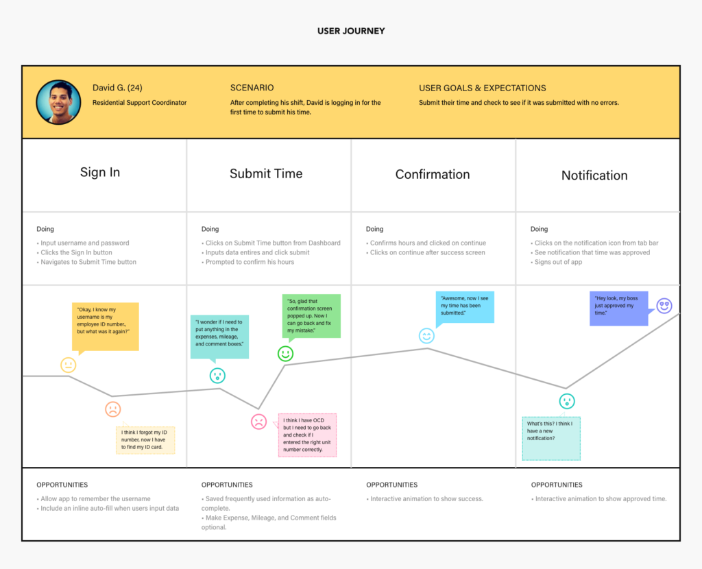
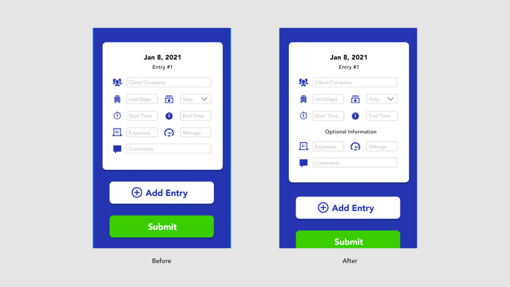
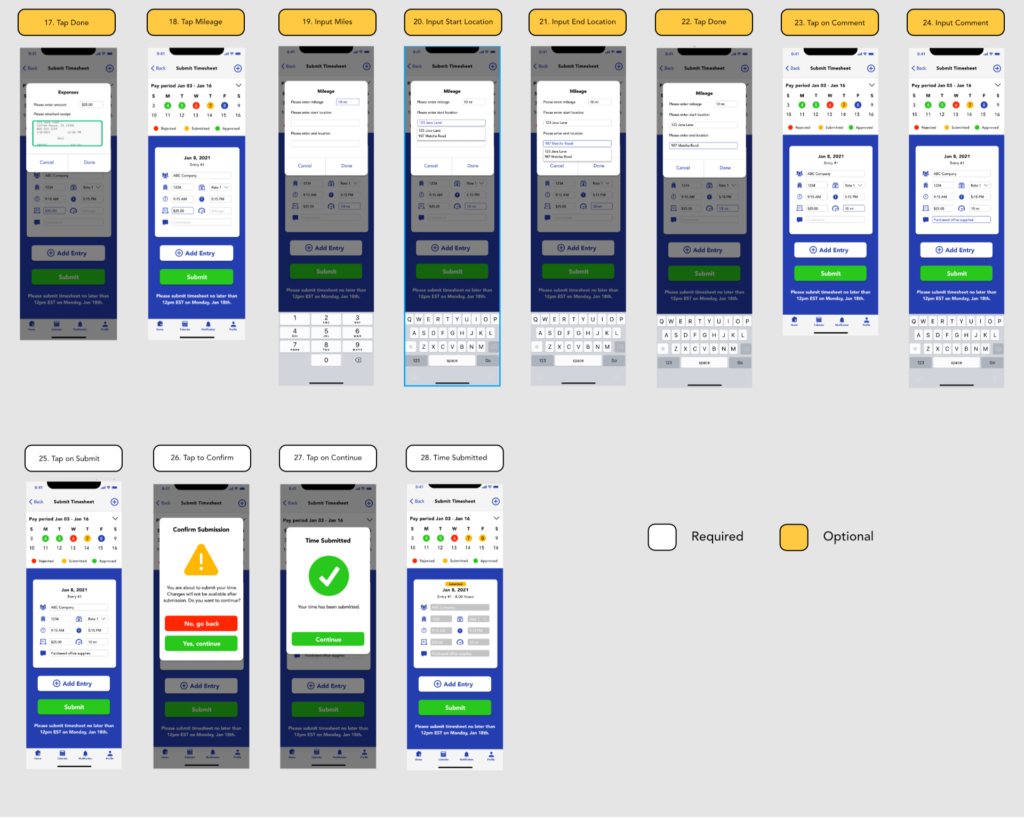
After conducting the usability testing, a participant mentioned that he was confused about whether or not he was supposed to input any data into the Expenses, Mileage, and Comment fields if there was nothing to report. Using this information, I had to reiterate and figure out a solution to inform the users without overwhelming them with too much information that the Expenses, Mileage, and Comment fields are optional. A solution that I came up with was to divide the required and optional input fields into two groups by adding a signifier between them indicating that the input fields below the signifier are all optional.
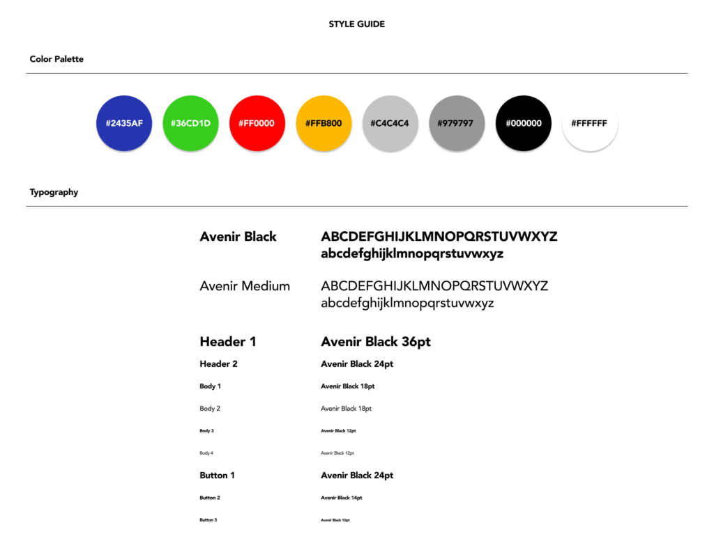
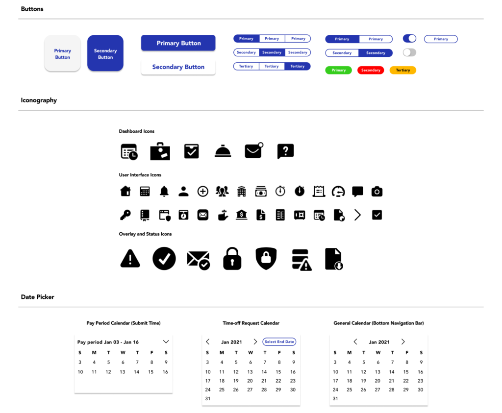
Style Guide: To maintain a consistent look of the user interface of the POM Payroll app, a style guide was established.
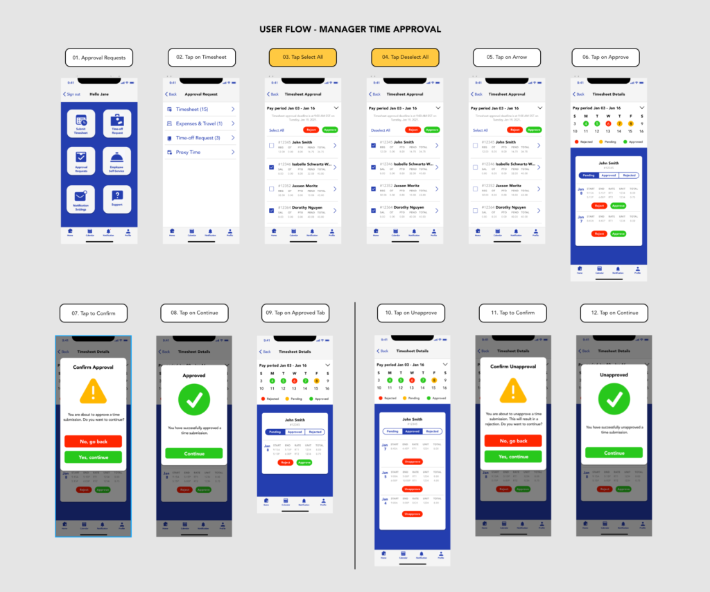
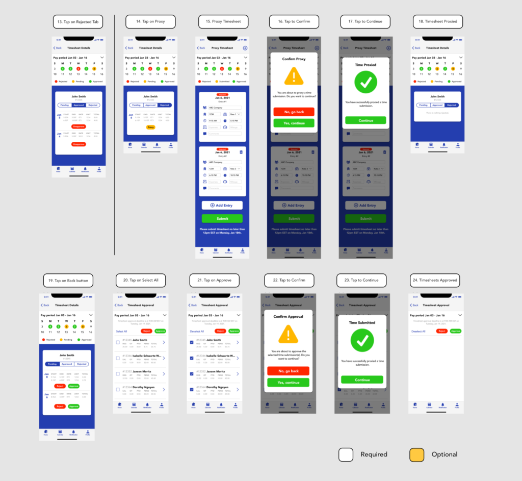
User Flows: Key deliverables of how a user completes a task such as submitting their time or approving times.
Feel free to test out the POM Payroll app demo here.
